 |
Download Now
Server 1 Download Now
Server 2 Download Now
Server 3
Inspired by various shapes such as leaves, flowers, hearts etc., Apresia Script is harmonically crafted.
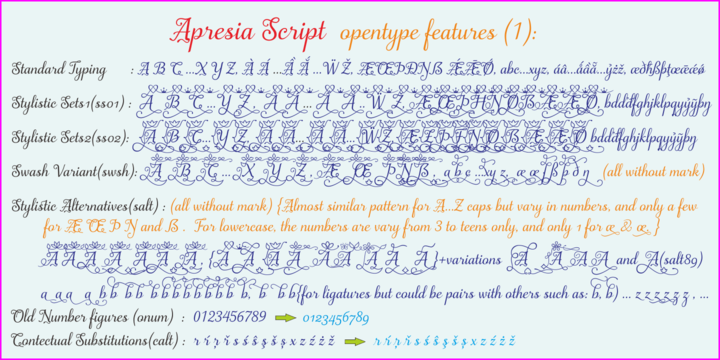
My first intention is only for standard design, but, later added simpler characters for normal(standard) typings. Apresia Script is rich with capital letter variants and ornaments. There are also lowercase variants in lesser numbers. I assume that many or perhaps most people want to have their name or the other of their important designs to be written with some letters that are in various shapes harmoniously. Apresia Script with more then 4000 glyphs support this aim, also support many latin based languages. However, because of many variations, except the standard characters, the full marked capitals are only set in two variants; in ss01 and ss02, which is also some marked lowercases included here. Swash variants (swsh) consist only one variant of every uppercase and lowercase characters, but no marked characters. All the others capital and lowercase variants are put in stlystic alternatives (salt). There are tens of unmarked caps and fewer for unmarked lowercase in salt (see Apresia Script opentype features(1) poster for some).
The ornaments can be accessed via opentype ornaments(ornm), using less(<) and greater(>)
characters for easier access. There are also beginning small letter(lowercase) ornaments, end
word(lowercase) ornaments and insertion ornaments to make your typing/design more flourish,
using ornm via “[“ (bracketleft), “]” (bracketright) and “\” (backslash), respectively. For marks; marks via combining marks and mkmk was set for many characters variants, however, it seem most applications not yet support this features. Alternatively, you can add non standard unicode
combining marks via ornaments for the language supported: asterisk “*” list for uppercase marks
above letters; ASCIIcircum “^” list for lowercase marks above letters; underscore “_” for uppercase
and lowercase marks below the letters; numbersign “#” for slashing characters, horn, caron
alternate and reversed comma for g, (see Apresia Script opentype features(2) poster and save it if
you download the font). Thus, it is recommended to have the application which are support these
opentype features such as: Adobe in Design, Adobe Illustrator, CorelDRAW or others for easier
accessing the glyphs. Still, for non supported applications, you can insert these glyphs via Character maps, insert symbols or other similar tools.
Apresia Script will go for most typing/design such as invitation, wedding card, greeting card,
banners, logos and many others. Use it for whatever you intended to, Apresia script will give an
amazing end design, though you are not a designer. As intended to be able to be used by many, this
font is set in an affordable price.
Thank you very much for downloading this font.
 |
| Download Apresia Script Font Family From Asritype |